Descriptive statistics summarize observed data; inferential statistics use a sampling design or model to make statements beyond those observations. The distinction matters even before choosing a plot.
A population is the set of units or outcomes the analysis concerns; a sample is the observed subset. In simple random sampling without replacement, all subsets of the chosen size are equally likely. Probability sampling more generally can use unequal, known inclusion probabilities. Non-probability selection does not provide that design-based foundation. Random selection alone does not ensure that a realized sample is representative or remove coverage, nonresponse and measurement problems. See Statistics Canada’s sampling guide.
A variable records a characteristic of an observational unit. Its type concerns the meaning of the values, not simply how they are stored:
Variables and their measurement meaning
Kind
Property
Example
Quantitative, continuous
Modeled on a continuous numeric scale; recording precision may round the observations.
Height
Quantitative, discrete
A finite or countable set of numeric values; counts are a common example.
Number of people in a room
Categorical, nominal
Categories without an intrinsic ordering; numeric codes do not make their differences meaningful.
Nationality
Categorical, ordinal
Ordered categories without an assumed equal numeric spacing.
Employment grades
Plate 8.1 — Variable types guide meaningful summaries. Nominal categories have no intrinsic order; ordinal categories can be ranked without assuming equal spacing. Quantitative variables may be continuous or discrete. Histograms can group either kind into numeric intervals: the vehicle counts in section 2 are discrete. The taxonomy alone does not determine a statistical test; the question, sampling design and assumptions also matter.
A statistic is calculated from a sample; a parameter describes the population or model of interest. For a particular sample, sampling error is the difference between an estimator and the corresponding population quantity. It is not a synonym for all measurement errors, selection bias or forecast errors.
Connect the data to the question
The traffic example below describes 31 consecutive days. Those days are not automatically an independent random sample of all future days. Generalizing forecast performance requires attention to time dependence, the validation design and possible changes in the generating process. A significance test alone does not establish representativeness.
2. Frequency distributions and the traffic counts
A frequency distribution records counts for values, categories or numeric intervals; relative frequencies divide by the declared total. A histogram groups quantitative observations, including discrete counts, into ordered numeric bins. A categorical bar chart compares categories. For a histogram, specify the bin edges and endpoint convention: the bin count alone is insufficient. For unequal widths, use count/width or relative frequency/width if bar area is to represent frequency or probability. Changing bins does not change the underlying observations.
The deck’s ago1 column contains 31 observations, one daily vehicle count for August. These are discrete quantitative data, even though a histogram groups them into intervals:
A reproducible histogram requires both a bin count and edges. NumPy’s histogram documentation uses the observed minimum and maximum by default. SciPy’s relfreq documentation instead expands each end by (max − min) / [2(k − 1)] for k bins. These defaults need not produce the same counts.
Recomputed from the observations
With ten expanded-range bins, the counts are 4, 1, 0, 2, 1, 2, 8, 5, 6, 2. With ten min–max bins they are 4, 1, 0, 2, 1, 2, 7, 6, 1, 7. Both total 31. Comparing the slide’s columns with these calculations shows that its counts match the min–max bins, while its proportions match expanded-range bins; its displayed interval labels are approximate. The old chapter’s purported correction instead summed to 32. The table below uses one explicit convention for every column.
The histogram, rebuilt from one data source
The same 31 daily counts drive the bars, table and summary. Change the number of bins or range convention; the observations and their mean stay fixed.
31 observations; 10 bins; SciPy-style expanded range. Mean = 4258.00; sample standard deviation (n−1) = 720.15. Included = 31; excluded = 0.
Histogram of observed August counts, not a fitted probability model. Bar height is the number of days in each interval; the vermilion line marks the mean. Bins have equal widths within each setting. Counts are also available in the table below.
Counts and proportions — 10 bins
Interval
Days
Relative
Cumulative
[2662.17, 2925.83)
4
0.1290
0.1290
[2925.83, 3189.5)
1
0.0323
0.1613
[3189.5, 3453.17)
0
0.0000
0.1613
[3453.17, 3716.83)
2
0.0645
0.2258
[3716.83, 3980.5)
1
0.0323
0.2581
[3980.5, 4244.17)
2
0.0645
0.3226
[4244.17, 4507.83)
8
0.2581
0.5806
[4507.83, 4771.5)
5
0.1613
0.7419
[4771.5, 5035.17)
6
0.1935
0.9355
[5035.17, 5298.83]
2
0.0645
1.0000
Included total
31
1.0000
1.0000
Intervals include the left endpoint and exclude the right, except the final interval, which includes both. Displayed edges are rounded to two decimals; assignment uses full-precision edges. Proportions are rounded only for display and may not sum to exactly 1 after rounding.
Use the same edges in Python
import numpy as np
from scipy import stats
import matplotlib.pyplot as plt

data = np.array([5012, 4948, 5077, 4960, 5010, 4170, 2916, 4442, 4301, 4931, 4533, 4438, 3707, 2794, 3148, 4086, 4355, 4272, 4389, 3546, 2827, 4505, 4598, 4646, 4406, 4586, 3801, 2845, 4919, 4663, 5167])
k = 10
pad = (data.max() - data.min()) / (2 * (k - 1))
edges = np.linspace(data.min() - pad, data.max() + pad, k + 1)
counts, _ = np.histogram(data, bins=edges)
relative = counts / data.size
cumulative = np.cumsum(counts) / data.size
print(counts)  # [4 1 0 2 1 2 8 5 6 2]
print(counts.sum())  # 31
res = stats.relfreq(data, numbins=k,
                    defaultreallimits=(edges[0], edges[-1]))
assert np.allclose(relative, res.frequency)
plt.hist(data, bins=edges, color='#1546B8', edgecolor='#F3EFE3')
plt.xlabel('Vehicles per day'); plt.ylabel('Days')
plt.show()
# For the min–max convention, use edges = np.linspace(data.min(), data.max(), k + 1).
# Recompute counts, proportions and the plot together after changing the edges.
Relative frequency is count / n; frequency density additionally divides by bin width. With unequal bin widths, plotting raw counts as heights makes the bar areas misleading. See the NIST histogram guide for normalization choices. Neither a histogram nor its binning establishes independence or a distributional model.
3. Measures of central tendency: mean, median, mode
Mean, median and mode summarize different aspects of location. For the numerical samples here, the arithmetic mean is x̄ = Σxᵢ/n; the median is the middle sorted value for odd n and the average of the two middle values for even n. Modes are values attaining the greatest observed frequency; there can be ties. A density’s peak and a histogram’s tallest bin are not the same object as a sample mode. See NIST’s location guide.
Worked source examples
Sample
Mean
Median
Mode
Motorway speeds (km/h)
137.14
132
124
Hotel quotes
293.83
283
274
The seven speeds are 151, 124, 132, 170, 146, 124, 113 km/h: their sum is 960, so x̄ = 960/7 = 137.142857…; the sorted values are 113, 124, 124, 132, 146, 151, 170. The six hotel quotes are 366, 327, 274, 292, 274, 230: the two central sorted values are 274 and 292, giving median 283.
Python: np.mean(x), np.median(x), and stats.mode(x). SciPy mode returns only one value when modes tie; use counts to retain all modes, as in the reproduction below. Italian Excel names include MEDIA, MEDIANA, and MODA.SNGL/MODA.MULT for single/multiple modes (the slides use legacy MODA); see the Microsoft function reference.
Robustness is not a claim that one summary is always better
Replacing one value x by x + Δ changes the sample mean by exactly Δ/n. The median depends on ranks and is less sensitive to moving an already extreme observation farther out, but it can change when observations cross the middle or enough values are replaced. Section 6 demonstrates this explicitly. Choose a summary for the question: expected total workload and typical daily workload need not have the same answer. Extreme but valid observations are not automatically errors.
For finite data, symmetry about c means that reflection x → 2c−x preserves values and multiplicities. For a distribution, the reflected random variable must have the same distribution; its mean need not exist. Equality of mean, median and mode is neither a definition nor a sufficient test of symmetry. A symmetric distribution or sample may also have modes away from its center.
Two synthetic counterexamples, with one dot per observation and the same numeric axis. Left: −4, −1, 0, 0, 0, 2, 3 have mean = median = mode = 0, but the reflected values do not match. Right: −2, −2, −1, 1, 2, 2 are symmetric about zero, yet their modes are −2 and 2. The dashed vermilion line marks zero. These are exact finite-sample examples, not normality tests.
Mean, median and the shape of a constructed sample
Transform an evenly spaced grid of 121 values using a. This is a deterministic illustration, not measured data or a fitted distribution. The parameter a is not a standardized skewness coefficient. The median stays at 100 by construction.
Transformation a = 0.00; mean = 100; median = 100. All 121 observed values are distinct: there is no unique sample mode. Highest-count bins: 1, 2, 4, 6, 8, 9, 11, 13, 14 (count 9 each). At a = 0, the evenly spaced sample is symmetric, not Gaussian.
The cobalt solid line marks the mean; the dashed vermilion line marks the median. They coincide at a = 0. Both the numeric horizontal range and bin width change with a, so compare numeric values rather than pixel shifts. Fourteen equal-width bins include their left endpoints; only the last includes its right endpoint. Bar heights are counts, not a density.
Fourteen equal-width bins for this setting
Bin
Numeric interval
Count
Highest count?
1
[40, 48.57)
9
Yes
2
[48.57, 57.14)
9
Yes
3
[57.14, 65.71)
8
No
4
[65.71, 74.29)
9
Yes
5
[74.29, 82.86)
8
No
6
[82.86, 91.43)
9
Yes
7
[91.43, 100)
8
No
8
[100, 108.57)
9
Yes
9
[108.57, 117.14)
9
Yes
10
[117.14, 125.71)
8
No
11
[125.71, 134.29)
9
Yes
12
[134.29, 142.86)
8
No
13
[142.86, 151.43)
9
Yes
14
[151.43, 160]
9
Yes
Total
All generated observations
121
None discarded
All original observations have frequency one. A highest-count histogram interval is a binning-dependent description, not a unique observed mode; all ties are shown. At a = 0, the grid is evenly spaced and small bin-count differences are discretization effects. Interval endpoints are rounded only for display.
Reproduce the transformation and histogram (Python)
import numpy as np

def transformed(a):
    u = (np.arange(121) - 60) / 60
    return 100 + 60*u if a == 0 else 100 + 60*np.expm1(a*u)/a

x = transformed(1.5)  # deterministic grid, not a random sample
edges = np.linspace(x.min(), x.max(), 15)
counts, _ = np.histogram(x, bins=edges)
print(x.mean(), np.median(x))
print(counts)
print(np.flatnonzero(counts == counts.max()) + 1)  # ALL highest-count bins
assert len(np.unique(x)) == 121  # no unique sample mode
# The central grid point u=0 maps to x=100 for every a.
4. Quartiles, percentiles and the IQR
Quantiles describe positions in an ordered distribution; percentiles use p/100, and Q1, Q2, Q3 correspond to p = 0.25, 0.5, 0.75. With the usual numerical median convention, Q2 is the median. Ties and finite samples prevent a guarantee that exactly 25% or 75% of observations are strictly below a reported quartile. Sample quantiles also depend on the selected estimator.
One population convention is Q(p) = inf{x: F(x) ≥ p} for 0 < p < 1. Interpolated sample estimators need not equal that inverse applied to the empirical CDF. NumPy’s linear method uses h = (n−1)p on the zero-based sorted array and interpolates between floor(h) and ceil(h). The slides instead use medians of halves in the worked examples; for seven values the middle observation is excluded from both halves.
Seven motorway speeds: declare the convention
Convention
Q1
Median
Q3
IQR
Slide: median of halves
124
132
151
27
Linear interpolation
124
132
148.5
24.5
IQR = Q3 − Q1. The slide’s 151 − 124 = 27 is correct for its convention; the linear result is 148.5 − 124 = 24.5. Only the value 113 is strictly below Q1 = 124; the two observations equal to 124 are not “below” it. Likewise 151 is not strictly above Q3 = 151. This is why strict percentage claims are misleading with ties and seven observations.
np.quantile(x, [.25, .5, .75], method='linear')
pd.Series(x).quantile([.25, .5, .75], interpolation='linear')
stats.iqr(x, interpolation='linear')  # 24.5 for these seven speeds
The IQR is a spread measure based on the central ranks, not squared distance from the mean. It is less sensitive to moving tail observations farther out, but it is not invariant under arbitrary data changes. Use the same quartile convention when calculating the fences in section 6.
5. Measures of dispersion: range, variance, CV
Spread has several definitions. Range = max − min uses the extremes; IQR uses quartiles; variance averages squared deviations from a specified center. Their sensitivity and units differ. The slide’s separate range example has min 25 and max 203 km/h, hence range 178; the seven motorway speeds instead have range 170 − 113 = 57 km/h. Python np.ptp(x) or max(x)-min(x) calculates a range; range() does not.
Separate descriptive spread from a variance estimator
Observed mean: x̄ = Σxᵢ / n
SS = Σ(xᵢ − x̄)²
Descriptive variance: vₙ = SS / n
Sample variance:      s² = SS / (n−1), n > 1
If the true mean μ is known: Σ(xᵢ − μ)² / n
vₙ describes the observed values; it does not require knowing a population mean. For an i.i.d. sample with finite population variance, s² is an unbiased estimator of that variance. If the true μ is known, the final formula is unbiased under that model, but it centers on μ, not on x̄. Do not label SS/n around the sample mean as the known-mean formula. These statements do not automatically apply to dependent traffic days or supply a valid confidence interval.
Standard deviation is the square root of the chosen variance. It has the original measurement units; variance has squared units. Taking the square root of an unbiased variance estimator does not generally produce an unbiased standard-deviation estimator.
Motorway speeds: deviations calculated before rounding
Speed (km/h)
xᵢ − x̄ (km/h)
(xᵢ − x̄)² (km/h)²
151
13.86
192.02
124
-13.14
172.73
132
-5.14
26.45
170
32.86
1079.59
146
8.86
78.45
124
-13.14
172.73
113
-24.14
582.88
Sum 960
0 exactly
2304.86
SS = 16134/7 = 2304.857143…; calculations use the unrounded mean 960/7. Cells and totals are rounded independently for display. In particular, √(SS/7) = 18.145669…, which rounds to 18.15 km/h at two decimals; the slide prints 18.14.
One sample, two declared denominators
Divisor
Variance (km/h)²
SD (km/h)
CV percent
n = 7
329.265306
18.145669
13.231217
n−1 = 6
384.142857
19.599563
14.291348
NumPy var and std default to ddof=0 (divisor n); use ddof=1 for n−1. pandas Series.std defaults to ddof=1. Defaults belong to individual functions, not to a library as a whole. Italian Excel uses VAR.P/DEV.ST.P for the n convention and VAR.C/DEV.ST.C for n−1.
CV requires a meaningful scale and a declared denominator
For positive ratio-scale quantities with a meaningful zero and positive mean, CV percent = 100 × SD/x̄. Its relative-spread interpretation needs that scale: multiplying all observations by the same positive constant leaves it unchanged, but adding an offset generally changes it. A Celsius/Fahrenheit conversion is not a pure rescaling. CV is undefined at zero mean and unstable near zero; it is not a universally meaningful comparison of arbitrary variables. See the NIST CV guide.
SciPy stats.variation returns SD/mean, not a percentage, and defaults to ddof=0. It does not take the absolute value of the mean, so it can return a negative number without establishing a meaningful relative-spread interpretation. For the speeds, multiply by 100 to obtain 13.23% with ddof=0 or 14.29% with ddof=1. The slide’s 14.3% agrees with the latter after rounding; its plain stats.variation(npa) call would not reproduce that convention.
Reproduce the source statistics and function defaults (Python)
import numpy as np
import pandas as pd
from scipy import stats

x = np.array([151, 124, 132, 170, 146, 124, 113], dtype=float)
mean = x.mean()
ss = np.sum((x - mean)**2)
print("Mean, median:", mean, np.median(x))
values, counts = np.unique(x, return_counts=True)
print("All sample modes:", values[counts == counts.max()])
print("Linear quartiles:", np.quantile(x, [.25, .5, .75], method="linear"))
s = np.sort(x)
print("Median-of-halves quartiles:", np.median(s[:3]), np.median(s[4:]))
print("Sum of squared deviations:", ss)
for ddof in [0, 1]:
    print("ddof, variance, SD, CV percent:", ddof,
          np.var(x, ddof=ddof), np.std(x, ddof=ddof),
          100 * stats.variation(x, ddof=ddof))
assert np.isclose(stats.variation(x), np.std(x, ddof=0)/mean)
assert np.isclose(pd.Series(x).std(), np.std(x, ddof=1))
assert np.isclose(stats.iqr(x), 24.5)
# Same numeric array, no missing values; defaults are function-specific.
For the 31 August counts, pd.Series(data).describe() reports mean 4258, sample SD 720.147901, min 2794, linear quartiles 3943.5 / 4438 / 4791, and max 5167. These summarize the recorded days; the output does not prove an i.i.d. sampling design. The frequency and box widgets use this same data source.
6. Box-plots, outliers and paired scatter-plots
A box-plot summarizes ordered quantitative data using a box from Q1 to Q3 and a median line. Specify its convention: a min–max plot extends its whiskers to the extremes; the 1.5·IQR variant used here ends them at the most extreme observations still inside the fences. Whiskers are observed values; fences are calculated thresholds. Neither is a confidence interval.
IQR = Q3 − Q1
Lower fence = Q1 − 1.5 × IQR
Upper fence = Q3 + 1.5 × IQR
Flag x only if x < lower fence or x > upper fence.
Plate 8.2 — The twelve rural-road speeds on one linear axis. The box spans 69–77 km/h, its median is 74, and the whiskers end at the actual minimum 62 and maximum 80. Dashed vermilion fences are 57 and 89; no supplied observation is outside them. Stacked dots retain repeated speeds; their vertical offset has no statistical meaning. The cobalt diamond marks the mean, 72.5.
The slide 30 data are 62, 64, 68, 70, 70, 74, 74, 76, 76, 78, 78, 80 km/h. Taking the median of each six-value half gives Q1 = (68 + 70)/2 = 69 and Q3 = (76 + 78)/2 = 77. Do not assume every library reproduces those quartiles: NumPy’s linear method interpolates at index (n−1)p and gives 69.5 and 76.5 for the same sample. Both conventions below have median 74, whiskers 62 and 80, and no flagged values.
Same twelve speeds, two quartile conventions
Convention
Q1
Median
Q3
IQR
Fences
Slide: median of halves
69
74
77
8
57 / 89
Linear interpolation
69.5
74
76.5
7
59 / 87
Reproduce the slide convention explicitly (Python)
An extreme observation can be a recording error, a legitimate rare event, or evidence that the model or grouping needs attention. Check its provenance and context; correct established errors and document justified exclusions. Otherwise retain the observation and consider robust summaries or sensitivity analyses. NIST distinguishes flagging from accommodation and formal identification.
The slides’ “always within 3 SD” wording is not a guarantee: a normal distribution has unbounded tails. For a single observation under known normal parameters, P(|X−μ| > 3σ) ≈ 0.0027, not zero. Estimated sample z-scores are a different calculation. Neither 1.5·IQR nor a 1.5–2 SD cutoff licenses automatic removal; trimming valid tails changes the data distribution and can bias the analysis.
Remeasure one day; recompute the whole box-plot
Use the same 31 August counts as section 2, replacing only day 31 (originally 5167, the largest count). The slider is a hypothetical remeasurement, not extra observed data. Quartiles use linear interpolation at zero-based index (n−1)p; the fences use Q1 − 1.5·IQR and Q3 + 1.5·IQR.
Day 31 = 5167 vehicles: inside the fences; not flagged. Mean = 4258 (originally 4258); median = 4438 (originally 4438). Q1 = 3943.5; Q3 = 4791. All quartiles and fences are recomputed; none is held fixed. Flagged observations are retained.
The axis remains fixed across slider settings. All 31 observations stay in the data; vermilion dots flag values strictly outside the dashed fences. The solid vermilion line is the median; the cobalt diamond is the mean. Exact summary values are below.
Try 3000: Q1, median and Q3 change as the replaced observation moves through the ordered sample. Try 9000: those three values stay at their original levels while the mean rises. This is a property of these data and replacements, not a rule that sample quantiles never move.
Scatter-plots must preserve the observational pairs
A scatter-plot places each matched pair (xᵢ, yᵢ) at its two numeric coordinates; discrete counts are allowed too. It can reveal nonlinear structure, clusters and unusual observations, not just linear correlation. Association does not establish causation, and zero Pearson correlation does not establish independence.
Correction to slide 36
The printed code independently sorts ago1 and set1. Matplotlib plots the supplied x/y positions; it does not repair the original pairing using pandas row labels. Sorting the columns separately can manufacture a positive trend. Sorting complete paired rows is safe because it changes only drawing order.
# Use this only if each existing row represents a meaningful matched unit.
# Otherwise first join on a verified observational key, not row position.
paired = df[['ago1', 'set1']].dropna()  # Remove incomplete PAIRS together.
plt.scatter(paired['ago1'].to_numpy(), paired['set1'].to_numpy())
# No independent sort_values(); sorting whole rows is harmless.
For counts from different months, matching equal day numbers is itself a design choice, not simultaneous observation. The available slide extraction does not establish a verified observational key for the two series. The illustration below therefore uses explicitly synthetic pairs, not an invented August–September correlation.
Pairing counterexample — identical axis scales and unchanged marginal values, but different pairs. Left: five synthetic observations A–E have Pearson r = 0. Right: sorting both columns independently gives artificial r = 1. Labels such as A/B mean x from A paired with y from B; only C/C retains its original match in this example. These coefficients describe the constructed data, not significance tests or real traffic measurements.
A probability distribution assigns probabilities to events. An empirical distribution describes observed frequencies; a theoretical model proposes probabilities for a random variable X. A histogram summarizes a sample using chosen bins, but a distribution is not necessarily a smooth curve fitted to a histogram. Distinguish counts, probability masses, densities and cumulative probabilities.
Density is not point probability
For an absolutely continuous variable, a probability density function f is nonnegative and ∫ f(x) dx over the whole real line equals 1. P(a < X ≤ b) = ∫ₐᵇ f(x) dx. An individual height f(x) is not P(X = x): point probabilities are zero, and density heights can exceed 1. If x carries units, density carries inverse units, so its area is dimensionless. Nonnegative density does not mean that x must be positive.
For a discrete variable, the probability mass function p(x) = P(X = x) assigns mass to each possible value; these masses sum to 1. For a fair die, p(3) = 1/6. A discrete probability is a mass, not an area under a continuous density. The binomial example in section 11 uses a PMF.
Cumulative distribution function
F(x) = P(X ≤ x) applies to discrete and continuous variables. It is nondecreasing, takes values in [0, 1], and approaches 0 and 1 at the two infinite limits. For a < b, F(b) − F(a) = P(a < X ≤ b). For an absolutely continuous distribution, F(x) = ∫₋∞ˣ f(t) dt; endpoints of an interval have zero probability. A discrete CDF has jumps: for a fair die, F(3) = 3/6 and its jump at 3 is 1/6. It is a cumulative distribution function, not another density.
The normal model
X ~ N(μ, σ²), with σ > 0, has mean μ and standard deviation σ. Its density is symmetric about μ and has support on the whole real line. Larger σ spreads the probability over a wider range and lowers the peak. This is a model to justify, not a default conclusion about any measured sample.
In SciPy norm, loc is μ and scale is σ, not σ². pdf evaluates density, cdf evaluates cumulative probability, and rvs generates random observations. These operations are different. Standardizing arbitrary data does not make their distribution normal.
One interval, two equivalent probability calculations
Calculated example, not fitted data: X ~ N(0, 0.25²), a = −0.25 and b = 0.25. Vermilion marks the PDF area and the matching vertical CDF difference. The dotted vertical lines share the same x positions in both panels. The peak dot marks a density height, not a point mass. The finite window [−1, 1] does not show the normal distribution’s entire support; vertical scales intentionally differ. Curves use 401 calculated points; probabilities below come from the CDF, not the polygon’s pixel area.
Same normal model; values rounded only for display
Quantity
Value
Interpretation
Density at zero: f(0)
1.595769
Height, not a probability; it can exceed 1.
Point probability: P(X = 0)
0
Zero for this absolutely continuous model.
CDF at a = −0.25
0.158655
P(X ≤ −0.25)
CDF at b = 0.25
0.841345
P(X ≤ 0.25)
Interval: P(a < X ≤ b)
0.682689
Area under f = F(b) − F(a).
Reproduce PDF/CDF values and compare three standard deviations (Python)
import numpy as np
import matplotlib.pyplot as plt
from scipy.stats import norm

x = np.linspace(-5, 5, 1001)  # display window, not the full support
fig, axes = plt.subplots(1, 2)
for sigma in [0.5, 1, 2]:
    axes[0].plot(x, norm.pdf(x, loc=0, scale=sigma), label=f"SD={sigma}")
    axes[1].plot(x, norm.cdf(x, loc=0, scale=sigma), label=f"SD={sigma}")
for ax, name in zip(axes, ["Density f(x)", "Cumulative probability F(x)"]):
    ax.set(xlabel="x", ylabel=name)
    ax.legend()
fig.tight_layout()
plt.show()

# The paired teaching figure uses a narrower normal: SD=0.25.
rv = norm(loc=0, scale=0.25)
print("Density at zero:", rv.pdf(0))  # 1.595769..., not a probability
print("P(-0.25 < X <= 0.25):", rv.cdf(0.25) - rv.cdf(-0.25))
# For this continuous model, P(X=0)=0.
Fitting compares candidates; it does not certify a model
The slides introduce Fitter and distfit. These examples retain their two separate synthetic samples: gamma with shape 2, location 1.5 and scale 2; then normal with mean 0 and SD 2. Both are seeded for reproduction, use 100 density-histogram bins and compare only norm, gamma and expon. The SciPy candidate name is norm, not normal. Parameters are fitted freely; the generating parameters are not supplied to the fitting tools.
For the settings below, SSE/RSS is Σⱼ(hⱼ − f̂(cⱼ))², comparing histogram density hⱼ with the fitted PDF at bin center cⱼ. Lower is better for that sample, binning and candidate set. This is not a p-value or an integrated probability; changing the bins can change the ranking. Candidate failure is checked explicitly. Neither sample represents the traffic observations elsewhere in the chapter.
Fitter: seeded gamma sample, three candidates (Python)
import numpy as np
import matplotlib.pyplot as plt
from scipy import stats
from fitter import Fitter

rng = np.random.default_rng(20260908)
data = stats.gamma.rvs(2, loc=1.5, scale=2, size=10000, random_state=rng)
candidates = ["norm", "gamma", "expon"]  # SciPy uses norm, not normal
f = Fitter(data, distributions=candidates, bins=100, density=True, verbose=False)
f.fit(max_workers=1, progress=False)
scores = f.df_errors["sumsquare_error"].reindex(candidates)
assert np.isfinite(scores.to_numpy()).all(), "At least one fit failed"
print(scores.sort_values())
print(f.get_best(method="sumsquare_error"))
name = scores.idxmin()
params = f.fitted_param[name]  # shape parameters (if any), loc, scale
grid = np.linspace(data.min(), data.max(), 501)
fig, ax = plt.subplots()
ax.hist(data, bins=100, density=True, alpha=0.25)
ax.plot(grid, getattr(stats, name).pdf(grid, *params), label=name)
ax.set(xlabel="Synthetic value", ylabel="Density")
ax.legend()
plt.show()
distfit: seeded normal sample, three candidates (Python)
import numpy as np
import matplotlib.pyplot as plt
from distfit import distfit

rng = np.random.default_rng(20260908)
data = rng.normal(loc=0, scale=2, size=10000)  # a separate synthetic sample
candidates = ["norm", "gamma", "expon"]
dfit = distfit(method="parametric", distr=candidates, stats="RSS", bins=100,
              mhist="numpy", n_boots=None, n_jobs=1, verbose="warning")
dfit.fit_transform(data)
scores = dfit.summary.set_index("name")["score"].reindex(candidates).astype(float)
assert np.isfinite(scores.to_numpy()).all(), "At least one fit failed"
print(scores.sort_values())
print(dfit.model["name"], dfit.model["params"])
grid = np.linspace(data.min(), data.max(), 501)
fig, ax = plt.subplots()
ax.hist(data, bins=100, density=True, alpha=0.25)
ax.plot(grid, dfit.model["model"].pdf(grid), label=dfit.model["name"])
ax.set(xlabel="Synthetic value", ylabel="Density")
ax.legend()
plt.show()
These snippets were executed with Fitter 1.8.0, distfit 2.0.2, NumPy 2.3.3, SciPy 1.16.2 and Matplotlib 3.10.7. The overlays deliberately show only the density fit, not automatically generated probability thresholds labelled as confidence intervals. In distfit, n_boots=None requests no bootstrap validation.
A winning candidate is not proof of the true family. In-sample fitting and model selection must be accounted for when calibrating goodness-of-fit tests; a standard known-parameter KS p-value is not automatically valid after estimating those parameters from the same sample. Parametric does not mean “always normal”, and nonparametric does not mean “assumption-free”. Choose a test for the question and sampling design, including pairing and dependence: see section 12 and the normality caveats in section 13. A density-fitting leaderboard alone does not authorize a test.
8. Inference: sampling, the CLT and z-scores
Inference estimates population/model quantities and quantifies uncertainty under a stated sampling design or probability model. A statistic such as x̄ varies from sample to sample; the target μ stays fixed within that model. The realized error x̄−μ is not the distance between arrows in a diagram. Random variation, systematic bias and measurement error are different issues.
Plate 8.3 — Sampling and estimation have different directions. The return arrow represents reasoning about parameters, not recovery of the full population or guaranteed unbiasedness. Inference depends on how observations were obtained and on the assumptions used to calculate uncertainty.
Sample size n is not the number of repetitions R
In the classical i.i.d. CLT, X₁,…,Xₙ are independent and identically distributed with finite mean μ and finite positive variance σ². As the number of observations within each sample grows, the standardized mean converges in distribution to N(0,1):
E[X̄ₙ] = μ;   Var(X̄ₙ) = σ²/n;   SD(X̄ₙ) = σ/√n
Zₙ = (X̄ₙ − μ)/(σ/√n)  →  N(0,1) as n → ∞
Repeating the sampling R times helps visualize the distribution at fixed n. Increasing R does not make that distribution more normal. Twenty repetitions are not a CLT threshold, and no universal n guarantees an accurate approximation for every distribution and tail probability. Independent normal observations give an exactly normal mean for every n. See the MIT CLT and standardization notes.
Analytic example, not source measurements: independent Exponential(rate 1) observations have mean and SD 1; their mean has Gamma(shape n, scale 1/n) density. Cobalt shows Zₙ = √n(X̄ₙ−1); dashed vermilion shows N(0,1). Panels have identical scales and 801 calculated points each. The finite window omits tails. n = 4, 16 and 64 changes observations per sample, not repetitions.
Unstandardized means in the exponential example
n
E[X̄ₙ]
SD(X̄ₙ)
Skewness
4
1
0.5
1
16
1
0.25
0.5
64
1
0.125
0.25
σ/√n is a standard error: the SD of the estimator across samples, not the spread σ of individual observations. With dependence, Var(X̄) = [Σ Var(Xᵢ) + 2Σᵢ<ⱼ Cov(Xᵢ,Xⱼ)]/n². Covariances cannot simply be discarded. Sampling without replacement from a finite population needs its design-specific correction. Shared train/test splits, cross-validation and consecutive traffic days do not become independent merely by calling them repetitions.
Finite variance matters: an average of independent standard Cauchy observations is again standard Cauchy, not a concentrating normal mean; its population mean and variance do not exist. Other limit theorems have different conditions. This CLT does not license every test on arbitrarily dependent or heavy-tailed losses.
Reproduce the exact standardized densities (Python)
import numpy as np
from scipy.stats import gamma, norm

z = np.linspace(-4, 4, 801)
for n in [4, 16, 64]:
    xbar = 1 + z/np.sqrt(n)
    exact = gamma.pdf(xbar, a=n, scale=1/n)/np.sqrt(n)
    reference = norm.pdf(z)
    print(n, "SD of mean:", 1/np.sqrt(n), "skewness:", 2/np.sqrt(n))
# Plot z against exact and reference on the same axes.
# These are analytic densities, not histograms of repeated simulations.
Standardization and normal probability bands
For any variable with finite mean μ and finite positive SD σ, Z = (X−μ)/σ has mean 0 and variance 1. It is standard normal only if X is normal. Using sample summaries gives descriptive standardized values, not automatically a standard-normal reference distribution. For normal X, μ±kσ corresponds to −k≤Z≤k:
Plate 8.4 — Nested normal population probability bands, calculated from PDF/CDF. The horizontal coordinate is z: zero corresponds to x = μ and ±k to x = μ±kσ. Areas are approximately 68.27%, 95.45% and 99.73%, not required realized sample frequencies. These are not confidence intervals for μ; section 9 instead uses uncertainty of an estimator.
Under an absolutely continuous model, interval probability is density area and a point has probability zero. This is not a universal ban on point probabilities: discrete PMFs assign positive masses. Standardization does not eliminate the need to justify a sampling model.
9. Confidence intervals: target, assumptions and coverage
A frequentist confidence interval is a procedure returning a random interval from a sample. Under its model, an exactly calibrated 95% procedure covers the fixed parameter in 95% of repeated samples. An observed interval either contains it or does not; the level is not a posterior probability assigned to μ after seeing the data. Approximate procedures need not attain exact nominal coverage. See NIST’s interpretation.
Known σ and estimated s require different pivots
Here z(p) is the standard-normal p-quantile; t(p, ν) is the p-quantile of Student’s t with ν degrees of freedom. The upper quantile for a two-sided level 1−α is p = 1−α/2.
Independent normal observations, known σ:
Z = (X̄ − μ)/(σ/√n) ~ N(0,1)
CI for μ: x̄ ± z(1−α/2) σ/√n

Independent normal observations, unknown σ, n > 1:
s² = Σ(xᵢ − x̄)²/(n−1)
T = (X̄ − μ)/(S/√n) ~ tₙ₋₁
CI for μ: x̄ ± t(1−α/2, n−1) s/√n
Two-sided z critical values are 1.959964… for 95% and 2.575829… for 99%; the slide’s 1.96 and 2.58 are rounded. With estimated spread under normal sampling, use the t construction, not merely z with s substituted for σ. Outside normal sampling, approximations need justification; neither n = 31 nor a normality pretest guarantees valid inference for dependent days.
Plate 8.5 — Twenty seeded samples of ten independent N(100,20²) observations yield x̄ ± 1.959964… × 20/√10. True μ = 100 stays fixed; dots and intervals vary. Solid cobalt intervals cover μ; dashed vermilion intervals miss it. Here 18/20 cover, not exactly 19/20: a finite batch need not match the procedure’s 95% probability. This is a labelled simulation, not the August data or validation of a traffic model.Reproduce all twenty samples and coverage decisions (Python)
import random
from statistics import NormalDist, mean
from math import sqrt

rng = random.Random(20260908)
mu, sigma, n, repeats = 100, 20, 10, 20
samples = [[rng.gauss(mu, sigma) for _ in range(n)] for _ in range(repeats)]
half = NormalDist().inv_cdf(0.975) * sigma/sqrt(n)
intervals = [(mean(x)-half, mean(x)+half) for x in samples]
covered = sum(lo <= mu <= hi for lo, hi in intervals)
print(covered, "of", repeats, "contain the fixed mu")
# The seed is fixed for reproduction, not chosen to force 19 of 20 successes.
# Coverage is a property over repeated samples, not a guarantee for this batch.
Seeded example: complete interval endpoints
Sample
Mean
Lower
Upper
Contains μ = 100?
1
102.310266
89.914365
114.706166
Yes
2
106.285692
93.889791
118.681592
Yes
3
103.170983
90.775082
115.566883
Yes
4
106.602033
94.206132
118.997933
Yes
5
95.703160
83.307260
108.099061
Yes
6
94.153150
81.757249
106.549050
Yes
7
105.940381
93.544481
118.336282
Yes
8
99.691306
87.295405
112.087206
Yes
9
100.750074
88.354173
113.145975
Yes
10
109.087568
96.691667
121.483468
Yes
11
111.503900
99.107999
123.899801
Yes
12
110.066749
97.670848
122.462649
Yes
13
100.333208
87.937307
112.729109
Yes
14
93.401395
81.005494
105.797295
Yes
15
112.831738
100.435838
125.227639
No
16
99.605250
87.209350
112.001151
Yes
17
94.524455
82.128555
106.920356
Yes
18
93.887825
81.491924
106.283726
Yes
19
107.305445
94.909544
119.701346
Yes
20
113.028349
100.632449
125.424250
No
Probability bands, mean CIs and predictions have different targets
Normal-model intervals: do not interchange their targets
Target
Two-sided formula
Meaning / assumptions
Population observation
μ ± z(1−α/2) σ
A central probability band for X with specified μ and σ; not a CI for μ.
Unknown population mean
x̄ ± t(1−α/2, n−1) s/√n
A CI for μ from independent normal observations with unknown spread.
One new observation
x̄ ± t(1−α/2, n−1) s√(1+1/n)
A prediction interval for one independent future observation from the same normal population.
The prediction interval includes estimation uncertainty and variation of the new observation. Coverage is over joint repetition of the training sample and new observation, not a guarantee that 95% of future values lie in every realized interval. Increasing n does not remove individual variability. A tolerance interval addressing a population proportion is another construction.
Compare conditional interval widths
A hypothetical fixed-summary calculator, not a live resampling experiment. The August values supply center 4258 and sample SD 720.147901. Changing n holds those two numbers fixed; it does not add observed days. The z row additionally supposes σ is known and numerically equal to that SD. This does not make σ known for the actual traffic data.
Hypothetical fixed summaries: center 4258.00, spread 720.15, n = 31; level 95.0%. z = 1.959964; t(30) = 2.042272. Changing n does not add traffic observations or validate independent normal sampling.
All endpoints are calculated around the same fixed center, in the original numeric units. z uses hypothetical known σ; the two t intervals use estimated s and n−1 degrees of freedom. The axis changes to include every endpoint: compare numeric widths, not pixel widths between settings. These are conditional formula evaluations, not validated inference for traffic days.
Conditional formulas evaluated at the fixed hypothetical summaries
Target / assumption
Critical value
Half-width
Lower
Upper
Mean CI · known σ scenario z × σ/√n
1.959964
253.51
4004.49
4511.51
Mean CI · estimated s scenario t × s/√n
2.042272
264.15
3993.85
4522.15
One future value · estimated s t × s√(1+1/n)
2.042272
1494.27
2763.73
5752.27
Increasing the level widens each interval. With fixed spread, larger n narrows all three here, but prediction retains the variability of a new observation. The exact 1/√n width scaling applies to the z mean interval with fixed level and σ; t critical values also change with n. At extreme settings, the normal-model prediction interval can extend below zero. We do not clip it: such limits can indicate that this continuous model is unsuitable for nonnegative counts.
Reproduce the n = 31 formula comparison (Python)
import numpy as np
from scipy.stats import norm, t

data = np.array([5012,4948,5077,4960,5010,4170,2916,4442,4301,4931,4533,4438,3707,2794,3148,4086,4355,4272,4389,3546,2827,4505,4598,4646,4406,4586,3801,2845,4919,4663,5167], dtype=float)
center, s, n = data.mean(), data.std(ddof=1), len(data)
level = 0.95
zcrit, tcrit = norm.ppf((1+level)/2), t.ppf((1+level)/2, df=n-1)
# Hypothetical known-sigma comparison: set sigma numerically equal to s.
# This does NOT make sigma known for the recorded traffic days.
sigma = s
halves = [zcrit*sigma/np.sqrt(n), tcrit*s/np.sqrt(n), tcrit*s*np.sqrt(1+1/n)]
for target, h in zip(["z mean CI", "t mean CI", "t prediction"], halves):
    print(target, center-h, center+h)
# Formula evaluation only: independent normal sampling is not established.
At the default summaries, the conditional 95% t mean interval is [3993.85, 4522.15]; the hypothetical known-σ z interval is [4004.49, 4511.51]. These calculations are not validated inference about traffic: σ is not known, independent normal sampling is not established, and the 31 days may be the complete descriptive period rather than a random sample from the intended target. Define the target and sampling model first.
Interval–test equivalence requires matching assumptions, statistic, sidedness, level and endpoint convention (section 10). A narrower interval is not automatically more trustworthy: a larger hypothetical n does not repair systematic error, dependence or model misspecification.
10. Hypothesis testing: H₀ and the p-value
A null hypothesis H₀ specifies a population/model claim, such as a head probability of 0.5. It is not universally the statement “everything is due to chance.” A test also needs assumptions, a statistic, an alternative, a rule for what counts as at least as extreme, and a significance level chosen before examining the outcome.
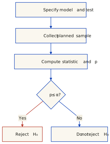
Plate 8.6 — A prespecified decision procedure. Both branches still require interpretation in context. Neither proves a hypothesis true. Sampling, measurement and model assumptions must be assessed; the p-value calculation does not automatically repair systematic bias.
A p-value is a probability under the specified null model of outcomes at least as extreme as the observation, using the chosen test’s ordering. It is not the probability that H₀ is true, nor the probability that the result arose “by chance alone.” The NIST testing guide explains the tail-probability interpretation; the ASA’s statement summary emphasizes model assumptions, context and complete reporting.
Exact fair-coin calculation
Let K be the number of heads in ten independent flips with common head probability θ. Under H₀: θ = 0.5, P(K = j) = C(10, j) / 2¹⁰ = C(10, j) / 1024. For eight heads:
One outcome: P(K = 8) = 45/1024 = 0.0439453125. This is not the test’s p-value.
Two-sided alternative θ ≠ 0.5: sum outcomes no more probable under H₀ than the observed one. For this symmetric distribution, these are K ≤ 2 or K ≥ 8, giving 112/1024 = 0.109375.
Neither of these p-values rejects at α = 0.05. Comparing just P(K = 8) with α does not implement either test. For a general asymmetric null, do not assume that every two-sided definition is twice the smaller tail. SciPy’s binomtest exposes the alternative explicitly.
Ten flips: outcome probability is not the p-value
Under H₀, ten independent flips have a constant head probability θ = 0.5. The controls compare prespecified alternatives; choosing a favorable tail after seeing the data is not a valid testing procedure.
Two-sided: θ ≠ 0.5. P(K = 8) = 45/1024 = 0.043945. p-value = 112/1024 = 0.109375 (10.9375%). At α = 0.05: do not reject H₀.
Plate 8.7 — Exact binomial null distribution for ten independent fair-coin flips. Vermilion bars are the outcomes included in the selected p-value; their probabilities are summed. The observed count has an ink outline. The red set is not the fixed rejection region: compare its total probability, not individual bar heights, with α = 0.05. All bars have the same width.
Exact probabilities and test decisions — Two-sided: θ ≠ 0.5
Heads j
P(K = j)
p-value
At α = 0.05
0
0.000977
0.001953
Reject H₀
1
0.009766
0.021484
Reject H₀
2
0.043945
0.109375
Do not reject H₀
3
0.117188
0.343750
Do not reject H₀
4
0.205078
0.753906
Do not reject H₀
5
0.246094
1.000000
Do not reject H₀
6
0.205078
0.753906
Do not reject H₀
7
0.117188
0.343750
Do not reject H₀
8
0.043945
0.109375
Do not reject H₀
9
0.009766
0.021484
Reject H₀
10
0.000977
0.001953
Reject H₀
Values are rounded for display only. The p-values in a column do not form a probability distribution and should not be added together. All decisions use the exact integer numerator over 1024.
A decision is not a proof or an effect size
This chapter uses the rule reject if p ≤ α, otherwise do not reject. Boundary conventions must be consistent; none of the ten-flip p-values equals 0.05. A rejection can be a Type I error. Non-rejection does not prove fairness, equality or equivalence; a small sample may have low power. Statistical significance also does not establish practical importance or a causal explanation.
Why is comparing each bar with 5% invalid here?
That rule rejects at K = 0, 1, 2, 8, 9 or 10. Under a genuinely fair coin those outcomes have combined probability 112/1024 = 10.9375%, exceeding the claimed 5% level. The valid two-sided rule rejects only at K = 0, 1, 9 or 10, totaling 22/1024 = 2.1484375%. Discreteness makes this nonrandomized test conservative.
Confidence sets can be built by inverting a specified family of tests. Then inclusion/exclusion of a null value matches non-rejection/rejection under that same construction, level and boundary convention. An arbitrary interval and a differently defined test need not agree, especially for discrete distributions. A single estimate lying in a central band of raw data is not this test–interval duality.
from scipy.stats import binomtest
for alternative in ['two-sided', 'greater', 'less']:
    result = binomtest(8, n=10, p=0.5, alternative=alternative)
    print(alternative, result.pvalue)
# two-sided 0.109375
# greater   0.0546875
# less      0.9892578125
When comparing forecasting methods, specify the loss, paired observations, time dependence and relevant effect size before selecting a test. A single significance threshold does not establish that two models are equivalent or identify a universally best model.
11. Degrees of freedom, tails, and Type I and II errors
Degrees of freedom depend on the statistic and model, not a universal “sample size minus one” rule. For example, estimating one sample mean leaves n − 1 freely varying residuals; the usual one-sample t statistic has that reference distribution under independent normal observations. The exact binomial test above instead uses n and the null head probability, without a t-style degrees-of-freedom parameter.
Choose a one-sided alternative when a direction is part of the question in advance; use a two-sided alternative for departures in either direction. Selecting the smaller one-sided p-value after observing the result changes the procedure and its error rate.
Probabilities refer to repeated samples under the stated model
Reality
Decision
Interpretation
H₀ is true
Reject H₀
Type I error. A valid level-α procedure controls this probability at most α under its assumptions; equality is not automatic.
H₀ is true
Do not reject H₀
Probability 1 minus the actual Type I error rate.
A specified alternative θ₁ is true
Do not reject H₀
Type II error, β(θ₁).
A specified alternative θ₁ is true
Reject H₀
Power, 1 − β(θ₁).
Power depends on the alternative, sample size, variability and decision rule. It is not determined by α alone, and a composite alternative generally has a power function, not one universal β. Which error is more costly depends on the application; Type I is not inherently the more serious error.
What are the size and power of the ten-flip two-sided test?
The rejection set is {0, 1, 9, 10}. Under θ = 0.5 its exact size is 22/1024 = 2.148438%, below 5%. Under the specific alternative θ₁ = 0.75, summing C(10, j) · 0.75ʲ · 0.25¹⁰⁻ʲ over the same rejection set gives power 255910/1048576 = 24.405479%. Therefore β(0.75) = 75.594521%: even this biased coin often fails to trigger rejection in ten flips.
These are exact calculations for independent Bernoulli trials, not a diagnosis of a physical coin or a general forecast-comparison result. Rejection does not logically prove the alternative; non-rejection does not prove equality. Report uncertainty and the experimental design along with the decision.
12. Choosing a test: question, design and assumptions
Start with the quantity to compare or association to describe, the measurement scale, the independent sampling unit, and the null/alternative hypotheses. A list of test names is not an automatic decision rule. In particular, a method that answers a question about means need not be interchangeable with one that answers a question about ranks or distributions.
Parametric does not mean Gaussian; non-parametric does not mean assumption-free
A parametric model specifies a family described by finitely many parameters—for example a normal model or the binomial model in section 10. Non-parametric procedures do not require such a fully specified parametric family, but still have assumptions about sampling, independence, exchangeability, symmetry or the measurement scale, depending on the procedure. Distribution-free null calibration holds under stated conditions, not for arbitrary data. Many, but not all, non-parametric procedures use ranks.
The slides mention non-normal shape, small samples and ordinal measurements as reasons to consider non-parametric methods. These are prompts to examine the design, not sufficient selection rules. A small sample does not remove the assumptions of a rank test, and a normality pretest does not by itself choose the right analysis. There is no universal power ordering: power depends on the alternative, sample size, design and procedure.
Compare category counts with specified probabilities. Account for parameters estimated from the sample and check expected counts; the asymptotic approximation may be poor for sparse data.
Test independence in a table of independent observational units. Sparse tables may need an appropriate exact or simulation-based procedure. Paired binary outcomes need a paired procedure, not this independent-unit table test.
Two quantitative or ordered variables
Pearson correlation; Spearman rank correlation
Pearson describes linear association; Spearman describes monotonic association through ranks. Their inferential assumptions and null calibration must be specified. Neither coefficient establishes causation.
Point-biserial is Pearson correlation with one variable coded 0/1; phi is Pearson correlation of two 0/1 variables. These are not generic rank-based alternatives to Pearson. A coefficient and a calibrated significance test are different objects.
Paired versus independent comparisons
Pairing comes from meaningful correspondence: two measurements on the same subject, or two model losses on the same held-out case or time point. Equal array lengths alone do not create pairs. For a paired analysis, form differences within the original units; independently sorting the two columns destroys the pairing. Independence between units is a separate condition from dependence within a pair.
The paired t-test targets a mean difference; its exact small-sample t calibration requires independent normal differences across units. Signed-rank uses the differences and a null symmetric about zero; it is not assumption-free. Specify handling of ties and zero differences.
Welch tests equal means without assuming equal population variances; pooled t adds that assumption. Mann–Whitney is a rank procedure for independent distributions; interpreting it as a location/median comparison needs additional shape assumptions. It does not generally test equal means.
ANOVA targets equality of means; classical F calibration assumes independent normal errors and common variance. Welch relaxes the variance assumption. Kruskal–Wallis compares ranks; a location interpretation needs comparable distribution shapes. Rejection does not identify the differing pairs.
Three or more conditions on the same units / blocks
Model within-unit dependence while keeping different units independent. Conventional repeated-measures ANOVA needs covariance assumptions such as sphericity or a suitable correction/model. Friedman ranks conditions within complete blocks; small-sample chi-square calibration can be unreliable.
The procedures in a row are candidates for different targets and assumptions, not interchangeable buttons. For multiple conditions, plan contrasts and multiplicity handling; an omnibus rejection is not evidence that every pair differs. For ordinal outcomes, use procedures justified for that scale instead of silently treating category codes as equally spaced measurements.
Ordered alternatives and multi-factor designs are different questions
Page tests an ordered trend across treatments observed on the same subjects/blocks. Jonckheere–Terpstra concerns ordered independent groups. They exploit a prespecified order; do not select the most favorable ordering after seeing the outcomes.
Two or more factors, possibly mixed within/between units
A factorial ANOVA or another model matching the outcome and dependence
Specify main effects, interactions, repeated measures and independent units. Page’s L is not a general replacement for factorial or mixed-design ANOVA. Rank, permutation and mixed-model approaches need their own design-specific justification.
For the project: pairing is not independence
Evaluating models on the same splits creates matched scores, but cross-validation scores need not be independent across splits because training/test observations are reused. Repeated folds are not automatically fresh experimental units. An ordinary paired t-test or signed-rank test on those fold scores does not automatically have its claimed error rate. The scikit-learn model-comparison example explains this dependence and a corrected variance approach for its particular design; it is not a universal correction for every validation scheme.
For forecasts, preserve time alignment and account for serial dependence, forecast horizon, the chosen loss and possible nonstationarity. Select an analysis appropriate to the evaluation design, and keep model selection separate from the final assessment. Merely calling the comparison “paired” does not justify a test, including Diebold–Mariano.
13. Assessing normality: plots, assumptions and tests
Not every parametric method assumes a Gaussian distribution: a binomial model is parametric too. When a method does require normality, identify which quantity the assumption concerns—for example model errors or paired differences, not automatically every raw variable. Graphs and tests provide complementary diagnostics; neither certifies a model from a finite sample.
1. Summary checks are not a calibrated normality test
The slides propose comparing mean and median within 1% of the range and checking the 68–95–99.7 percentages with at least 50 observations. Treat those as informal teaching heuristics, not a universal threshold or required minimum. Symmetry alone does not imply normality (a uniform distribution is symmetric too). A random normal sample need not meet exact population percentages or have equal sample mean and median. Outliers can also inflate the range and make a range-based tolerance misleading.
2. Histograms reveal shape, but depend on the bins
Look for asymmetry, multiple modes and unusual tails, checking more than one sensible binning. Small samples make shape particularly uncertain. If a normal density curve is overlaid, use a density-normalized histogram or scale the curve to expected bin counts; a probability density and an unscaled count histogram have different vertical units. See the histogram widget in section 2 for how counts change with bin boundaries.
3. A Q–Q plot pairs ordered observations with theoretical quantiles
Sort the observations, assign increasing plotting probabilities pᵢ, then calculate zᵢ = Φ⁻¹(pᵢ), where Φ is the standard normal cumulative distribution function. Plot zᵢ horizontally and the ordered observations vertically. A roughly linear pattern is a useful diagnostic; a normal sample does not give an exact line. The NIST normal probability plot guide uses a different plotting-position convention (approximate order-statistic medians). Here we retain the slides’ midpoint convention, pᵢ = (i − ½)/n. These are chosen probability positions, not a claim that actual random observations enclose exactly equal probability mass.
The seven original values are −4, −3, 0.8, 1.8, 3.9, 6.2 and 6.5. Their mean is 1.742857. Define dₙ = √[Σ(xᵢ − x̄)²/n] = 3.845538: this reproduces the slides’ rounded 3.85. The n−1 sample standard deviation is instead s = 4.153656. This drawing deliberately uses dₙ, so the reference line is y = x̄ + dₙz; it is a descriptive fitted line, not an uncertainty interval.
Plate 8.8 — Vermilion points are the seven actual observations at their calculated standard-normal quantiles. The cobalt dashed line has intercept 1.7429 and slope 3.8455 in data units per z-unit. Its on-screen angle depends on axis scaling. Seven points alone cannot establish normality; there is no acceptance band in this drawing.
Full-precision calculations; displayed numbers rounded to six decimals
i
Observed
pᵢ = (i − ½)/7
zᵢ = Φ⁻¹(pᵢ)
Fitted quantile
1
-4
0.071429
-1.465234
-3.891755
2
-3
0.214286
-0.791639
-1.301419
3
0.8
0.357143
-0.366106
0.334981
4
1.8
0.500000
0.000000
1.742857
5
3.9
0.642857
0.366106
3.150733
6
6.2
0.785714
0.791639
4.787134
7
6.5
0.928571
1.465234
7.377470
The final column is qᵢ = x̄ + dₙzᵢ in the observations’ units. If qᵢ were used on the horizontal axis instead, the reference would be y = x, visually 45° only with equal unit scaling. Do not confuse these two axis conventions. Table and figure use unrounded pᵢ throughout; the displayed 0.071429 is not substituted back into the inverse CDF.
Reproduce the seven coordinates with Python’s standard library
from statistics import mean, pstdev, NormalDist
x = sorted([-4, -3, 0.8, 1.8, 3.9, 6.2, 6.5])
mu, d = mean(x), pstdev(x)  # denominator n, matching this figure
for i, observed in enumerate(x, 1):
    p = (i - 0.5) / len(x)
    z = NormalDist().inv_cdf(p)
    print(i, observed, p, z, mu + d * z)
Software defaults are part of the specification. In statsmodels.qqplot, the default offset is a = 0, producing i/(n+1), and line='q' draws a quartile-based line. Those defaults do not reproduce this table or its mean/scale line. Use a = 0.5 for the midpoint positions and explicitly supply the intended reference line when recreating this figure.
4. Statistical tests answer a specified null hypothesis
Shapiro–Wilk tests the normal family with unspecified location and scale; it is not simply a KS test with fitted parameters. Anderson–Darling and D’Agostino’s K-squared are other normality procedures with their own calibration and requirements. A chi-square goodness-of-fit test requires choices of bins and appropriate expected counts. There is no universal power ranking: small samples can miss meaningful departures, while large samples can detect departures too small to matter for the intended analysis.
The usual one-sample Kolmogorov–Smirnov test instead requires a fully specified continuous null distribution. Estimating its parameters on the tested sample invalidates the usual null calibration; a suitable fitted-parameter procedure such as the normal Lilliefors test, or a correctly calibrated simulation procedure, is needed. Independence and the sampling/model assumptions still matter.
"""Same seeded sample, three explicitly different null hypotheses."""
import numpy as np
from scipy.stats import shapiro, kstest

# Preserve the lecture's legacy random stream, not default_rng's different stream.
data = 20 * np.random.RandomState(20).randn(100) + 100
alpha = 0.05
tests = [
    ("Some normal distribution", shapiro(data)),
    ("Specified N(0, 1)", kstest(data, "norm")),
    ("Specified N(100, 20²)", kstest(data, "norm", args=(100, 20))),
]
for null, result in tests:
    decision = "Reject H0" if result.pvalue <= alpha else "Do not reject H0"
    print(f"{null}: statistic={result.statistic:.6g}, p={result.pvalue:.6g}; {decision}")
# The last null uses the known generating parameters, not estimates from data.
# Non-rejection is not proof of normality; p printed as 0 can reflect numerical limits.
This is synthetic data generated with mean 100 and standard deviation 20, not an observed data set known to be normal. A rejection of the standard N(0,1) null is not evidence against every normal distribution. The third test uses the generating parameters fixed independently of the sample. A p-value printed as zero can reflect numerical limits, not a literal probability of zero. Report the null, assumptions, statistic and p-value; say “do not reject” rather than “accept” or “proved Gaussian.”
14. Student’s t, Diebold–Mariano and forecast alignment
Student’s t is a family indexed by degrees of freedom. For an independent normal sample with unknown variance, the standardized sample mean uses a t reference with n−1 degrees of freedom. Unknown variance alone does not make every statistic exactly t-distributed. Other uses, including the modified forecast-comparison test here, have their own justification and limitations.
Define the loss and the comparison before testing
For aligned forecasts of the same target, let dₜ = L(e₁ₜ) − L(e₂ₜ). The Diebold–Mariano null is equal expected loss, E[dₜ] = 0, for the chosen loss and forecast setting—not equal predictions at every time or equal accuracy under every metric. Positive average d means the first forecast has larger observed loss. The author’s retrospective working paper emphasizes comparing forecasts and making assumptions about their loss differences, rather than requiring knowledge of a model’s architecture.
The unmodified statistic is d̄ / √(Ω̂/n), where Ω̂ estimates the long-run variance of d. Its normal reference is asymptotic and needs suitable stationarity, moment and dependence conditions plus consistent variance estimation. Serial dependence, nonstationarity, parameter estimation and nested-model settings require care. “Model-free” does not mean assumption-free.
The printed statistic uses a modified test, not a normal critical value
The implementation linked by the slides applies the Harvey–Leybourne–Newbold adjustment and evaluates a two-sided t tail with n−1 degrees of freedom. The forecast package also documents a modified test. For this example n = 12 and h = 1: γ̂₀ = Σ(dₜ − d̄)²/n, the unmodified statistic is d̄/√(γ̂₀/n), and the adjustment multiplies it by √(11/12). This equals the ordinary t statistic of the loss differences algebraically; that identity does not prove those differences independent or normal.
Use the matching 5% two-sided critical values ±2.200985 from t₁₁, not ±1.96. With h = 1 this implementation keeps only lag zero; the horizon does not establish that all other autocovariances vanish. The modified t reference is not an exact finite-sample guarantee for arbitrary forecast errors, especially with only twelve observations.
Audit the two conflicting MLP sequences
The slide 66 list begins 414.231, 417.662, 381.815; the slide 67 executable example moves 414.231 to the end. Actual and LSTM arrays are unchanged. Without timestamped prediction exports and training/evaluation provenance, these sources do not identify which alignment is correct. Do not rotate predictions to obtain a more favorable score. Both calculations below preserve their respective printed orderings.
Alignment audit — bars are calculated squared-error differences at the twelve printed positions. Cobalt uses the slide 66 MLP list; vermilion uses the rotated slide 67 code list. Tiny bars can be difficult to see on this common linear scale; exact source values and displayed loss differences are in the table. This is an audit of the supplied numbers, not newly trained models or verified out-of-sample performance.
All 12 printed positions; loss differences rounded to six decimals
Pos.
Actual
MLP list
MLP code
LSTM
List loss gap
Code loss gap
1
417
414.231
417.662
416.999
7.667360
0.438243
2
391
417.662
381.815
390.999
710.862243
84.364224
3
419
381.815
423.952
418.999
1382.724224
24.522303
4
461
423.952
469.055
461.000
1372.554304
64.883025
5
472
469.055
471.502
471.999
8.673024
0.248003
6
535
471.502
547.532
535.000
4031.996004
157.051024
7
622
547.532
639.609
622.000
5545.483024
310.076881
8
606
639.609
596.040
606.000
1129.564881
99.201600
9
508
596.040
477.471
507.999
7751.041599
932.019840
10
461
477.471
445.010
461.000
271.293841
255.680100
11
390
445.010
368.674
390.000
3026.100100
454.798276
12
432
368.674
414.231
431.999
4010.182275
315.737360
Squared loss, h = 1, modified statistic and two-sided t reference with 11 df
MLP order
Mean loss difference
Modified DM
p-value
Slide 66 list
2437.345240
3.429053
0.00563247
Slide 67 code
224.918407
2.933300
0.01360984
The code ordering reproduces modified DM = 2.933300 and p = 0.01360984. The list ordering instead gives 3.429053 and 0.00563247. Both arithmetic decisions reject at 5% under this specified procedure, but neither establishes that the data preparation or forecast alignment is valid. The p-value is not the probability that the difference was “due to chance,” and rejection is not proof of universal LSTM superiority.
For comparison, the unmodified code-order statistic is 3.063732; a normal-tail calculation for that statistic gives 0.00218594. Do not combine a statistic from one variant with a p-value or critical value from another. The LSTM values differ from all twelve actual values by at most 0.001; their mean squared error is 5.000000e-7. This calls for checking the prediction pipeline and data availability, not assuming either extraordinary generalization or leakage from these numbers alone.
Reproduce both calculations (Python with SciPy)
"""Reproduce the two printed orderings; this does not validate forecast provenance."""
import json
import math
from scipy.stats import t, norm

ACTUAL = [417, 391, 419, 461, 472, 535, 622, 606, 508, 461, 390, 432]
MLP_LIST = [414.231, 417.662, 381.815, 423.952, 469.055, 471.502,
            547.532, 639.609, 596.040, 477.471, 445.010, 368.674]
MLP_CODE = [417.662, 381.815, 423.952, 469.055, 471.502, 547.532,
            639.609, 596.040, 477.471, 445.010, 368.674, 414.231]
LSTM = [416.999, 390.999, 418.999, 461.000, 471.999, 535.000,
        622.000, 606.000, 507.999, 461.000, 390.000, 431.999]


def calculate(actual, first, second):
    # Deliberately limited to this 12-position, squared-loss, h=1 worked example.
    if any(not isinstance(x, list) or len(x) != 12 for x in (actual, first, second)):
        raise ValueError("This example requires three aligned lists of length 12")
    if any(type(v) not in (int, float) or not math.isfinite(v) or abs(v) > 1e6
           for x in (actual, first, second) for v in x):
        raise ValueError("Expected finite numeric values of magnitude at most 1e6")
    n = len(actual)
    loss1 = [(a - p)**2 for a, p in zip(actual, first)]
    loss2 = [(a - p)**2 for a, p in zip(actual, second)]
    differences = [a - b for a, b in zip(loss1, loss2)]
    mean = math.fsum(differences) / n
    gamma0 = math.fsum((d - mean)**2 for d in differences) / n
    if gamma0 <= 0:
        raise ValueError("A positive loss-difference variance is required")
    raw = mean / math.sqrt(gamma0 / n)
    factor = math.sqrt((n - 1) / n)  # Harvey–Leybourne–Newbold factor at h=1
    modified = factor * raw
    return dict(mean=mean, mse1=math.fsum(loss1)/n, mse2=math.fsum(loss2)/n,
                differences=differences, gamma0=gamma0, raw=raw, factor=factor,
                statistic=modified, pvalue=float(2*t.sf(abs(modified), n-1)),
                critical=float(t.ppf(0.975, n-1)), normalP=float(2*norm.sf(abs(raw))))


def example():
    return dict(n=12, h=1, loss="squared error", df=11, alpha=0.05,
                actual=ACTUAL, lstm=LSTM, mlpList=MLP_LIST, mlpCode=MLP_CODE,
                listResult=calculate(ACTUAL, MLP_LIST, LSTM),
                codeResult=calculate(ACTUAL, MLP_CODE, LSTM))


if __name__ == "__main__":
    print(json.dumps(example(), indent=2, allow_nan=False))
Critical-difference diagrams summarize a defined analysis
A critical-difference diagram can show average ranks alongside pairwise post-hoc results. A crossbar denotes non-rejection under the chosen procedure and threshold, not equivalence or identical performance. Non-rejection need not be transitive, and ranks alone do not determine adjusted p-values. Distinguish a common critical-distance procedure from pairwise Wilcoxon tests with Holm adjustment; do not manufacture one shared distance for arbitrary pairwise results.
The slides describe five labelled methods, but the available extraction does not provide the full score matrix or adjusted pairwise p-values. Its specific crossbars cannot be numerically reproduced from this material alone. For multiple forecasting methods, choose valid comparisons and multiplicity handling for the actual dependence structure; adding models does not automatically justify a repeated-measures test on overlapping fold scores.
What makes a forecast comparison reproducible
Report target timestamps, forecast origins, horizon, training cutoffs and preprocessing; paired predictions and actuals; loss and direction; variance estimator and lags; correction and reference distribution; sample size, statistic, critical value and p-value; selection/multiplicity handling and relevant effect sizes. The unresolved source alignment is part of this example’s result, not a detail hidden by a significant p-value.
Check your understanding
Define population, sample, and the two ways a sample can be chosen.
A population is the set of units or outcomes the analysis concerns; a sample is the observed subset. In simple random sampling without replacement, all subsets of the chosen size are equally likely. Probability sampling more generally can use unequal, known inclusion probabilities. Non-probability selection does not provide that design-based foundation. Random selection alone does not ensure that a realized sample is representative or remove coverage, nonresponse and measurement problems. See Statistics Canada’s sampling guide.
Classify variables, and give the defining property of each class.
Continuous quantitative variables are modeled on a numeric continuum (height); discrete quantitative variables have a finite or countable set of possible numeric values (counts of people). Nominal categories have no intrinsic order (nationality); ordinal categories have an order but no assumed equal spacing (employment grades). A numeric category code is not a measurement scale. Discrete counts can still be grouped into numeric histogram intervals.
What are descriptive statistics, parameters, inferential statistics and the sample error?
Descriptive statistics are quantities and techniques used to describe the characteristics of a data set (mean, standard deviation, box-plot). Parameters describe the characteristics of a population; they are usually unknown, and we want to make a statistical inference about them. Inferential statistics are techniques to analyze samples and generalize them to the population. The sample error is the difference between sample statistics and the values of the corresponding population parameters.
What is a frequency distribution, and how does a relative frequency distribution differ from it?
A frequency distribution records counts for values, categories or numeric intervals; relative frequencies divide by the declared total. A histogram groups quantitative observations, including discrete counts, into ordered numeric bins. A categorical bar chart compares categories. For a histogram, specify the bin edges and endpoint convention: the bin count alone is insufficient. For unequal widths, use count/width or relative frequency/width if bar area is to represent frequency or probability. Changing bins does not change the underlying observations.
Give the definitions and the Excel/Python functions for mean, median and mode.
For numerical data, the mean is Σxᵢ/n; the median is the central sorted value or the average of the two central values; modes attain the highest observed frequency and can tie. Python: np.mean, np.median; stats.mode returns one mode, not all ties. Italian Excel: MEDIA, MEDIANA, MODA.SNGL/MODA.MULT. The speeds have mean 137.142857…, median 132 and mode 124.
Why is the median a better measure of centrality than the mean on distorted distributions, and when are data called symmetric?
The median is less sensitive to moving already extreme observations farther out, but it can change when ranks around the center change. It is not automatically better for every target. Symmetry means invariance under reflection about a center, not merely equality of three summaries. −4, −1, 0, 0, 0, 2, 3 have mean = median = mode = 0 but are not symmetric. The widget fixes its median by construction and does not have a unique sample mode.
Define quartiles, percentiles and the IQR, and state the relation between median, Q2 and the 50th percentile.
Quartiles correspond to probabilities .25, .5 and .75; Q2 is the usual numerical median. Declare the sample quantile convention. Ties and finite samples prevent exact strict-below percentage claims. IQR = Q3 − Q1: the slide’s median-of-halves motorway example gives 27, whereas linear interpolation gives 24.5. Neither convention can be substituted silently in the fences.
Define range, variance, standard deviation and coefficient of variation, and state when n − 1 is used instead of n.
Range is max − min. Descriptive variance is SS/n around x̄; SS/(n−1) is unbiased for population variance under i.i.d. sampling with finite variance. A known-mean formula instead centers on the true μ. SD is the square root, not generally an unbiased estimator itself. CV percent is 100 × SD/mean, meaningful on suitable positive ratio scales and unchanged only by positive rescaling, not arbitrary offsets. NumPy var/std and SciPy variation default to ddof=0; pandas Series.std defaults to 1. The speeds give SD 18.15 and CV 13.23% with n, or 19.60 and 14.29% with n−1.
What does a box-plot show, and how are outliers defined in one?
Specify the quartile and whisker conventions. In the 1.5·IQR version, the box is Q1–Q3 with the median inside; whiskers reach the extreme observations within Q1 − 1.5·IQR and Q3 + 1.5·IQR. Values strictly outside are flagged, not automatically deleted. The rural-road example has no flagged observations. The slide uses median-of-halves quartiles, while the traffic widget recomputes linear-interpolated quartiles. Quantiles can change when observations change; a normal model does not guarantee every value lies within 3 SD. In a scatter-plot, keep each x paired with its own y; sorting the columns separately can create artificial association.
Distinguish PDF, PMF and CDF.
For an absolutely continuous variable, a PDF f is nonnegative and integrates to one: interval probabilities are areas, not individual heights; P(X=x)=0 even when f(x)>1. For a discrete variable, a PMF p(x)=P(X=x) assigns masses summing to one. The cumulative distribution function F(x)=P(X≤x) applies to both. For a<b, F(b)−F(a)=P(a<X≤b); a discrete CDF has jumps. CDF means cumulative distribution, not cumulative density.
State the key result about repeated sampling and the normal distribution, and the 68-95-99.7 rule.
For i.i.d. observations with finite positive variance, the standardized sample mean converges in distribution to N(0,1) as observations per sample n grow. Repetitions R do not make a fixed-n distribution more normal; twenty repetitions are not a threshold. Independent normal observations give an exactly normal mean for every n. Normal population areas within 1, 2 and 3 SD are approximately 68.27%, 95.45% and 99.73%, not guaranteed sample fractions. Dependence and infinite variance require different arguments.
What is a z-score, and how are probabilities read on the normal curve?
Z=(X−μ)/σ measures distance from the mean in SD units, assuming finite mean and positive finite SD. It has mean zero and variance one but is normal only if X is normal. Standardizing arbitrary sample values does not establish normality. Under an absolutely continuous model, interval probabilities are density areas and point probabilities are zero; discrete PMFs assign point masses. Normal population bands are not confidence intervals for an unknown mean.
Write the two standard confidence intervals for a population average and interpret a 95% interval.
For an independent normal sample with known population standard deviation σ, the usual mean intervals are x̄ ± 1.96σ/√n (approximately 95%) and x̄ ± 2.576σ/√n (approximately 99%). With unknown σ estimated from a normal sample, use the corresponding t critical value and s/√n. Coverage concerns repeated samples, not a probability assigned to the fixed parameter after observing an interval. Test–interval equivalence requires matched constructions; see section 10.
Define the null hypothesis and the decision rule of a test, and re-derive it on the coin example.
H₀ states a model/parameter claim. Specify the alternative, statistic, assumptions and α before seeing the result. Reject when the chosen p-value is at most α. For eight heads in ten independent fair-coin trials, P(K = 8) = 45/1024, but the upper-tail p-value is 56/1024 and the two-sided p-value is 112/1024. Neither rejects at 5%. Non-rejection is not proof of fairness.
Define the p-value and the significance/interval equivalence.
The p-value sums null-model probability for outcomes at least as extreme as observed under the chosen test. It is not P(H₀ is true) or an effect size. Inverting the same tests constructs a confidence set whose null values correspond to non-rejection, with matching level and boundary convention. Do not assume an unrelated interval or a central raw-data band has this property.
Define degrees of freedom, one- and two-tailed tests, and the two types of error with their probabilities.
Degrees of freedom depend on the model/statistic; n − 1 is one common case, not a universal rule. Choose the alternative before observing data. Type I means rejecting a true null; a valid level-α test controls its rate at most α. Type II means not rejecting under a specified alternative, with probability β; power is 1 − β. Neither decision proves a hypothesis, and neither error type is universally more serious. The ten-flip example has size 22/1024, not exactly 5%.
Contrast parametric and non-parametric tests, and give the three situations that justify non-parametric ones.
Parametric models use a finite-dimensional family, not necessarily Gaussian. Non-parametric methods still have sampling/design assumptions and are not uniformly less powerful. Non-normal shape, a small sample or an ordinal scale can motivate considering alternatives, but none selects a valid test automatically. Specify the target, independent units, pairing and the particular method’s assumptions.
Which test for which situation? Give at least the two-condition paired and unpaired cases, and the 3+ condition cases.
For two paired conditions, a paired t-test targets the mean difference; signed-rank needs a suitable symmetric-difference null. For two independent groups, Welch tests means without equal variances; Mann–Whitney is rank-based and needs further assumptions for a median/location interpretation. For 3+ independent groups consider an appropriate ANOVA or Kruskal–Wallis; for complete repeated blocks, repeated-measures models or Friedman. Page’s L and Jonckheere–Terpstra target prespecified ordered alternatives, not general factorial effects. Separate categorical goodness of fit from independence, and do not classify point-biserial or phi as generic rank alternatives. Shared CV folds create pairing but do not establish independent score differences.
Describe the four ways to check normality that the deck gives, and the Q-Q plot procedure.
Use summary heuristics, histograms, Q–Q plots and suitably calibrated tests as complementary diagnostics. Symmetry, the 1%-of-range heuristic and a sample-size cutoff do not establish normality. For this Q–Q example, sort the seven observations and use pᵢ = (i − ½)/7; plot Φ⁻¹(pᵢ) against the ordered observations. The line uses the mean and n-denominator scale, not a mandatory 45° angle. Other plotting-position and line conventions exist. Shapiro–Wilk tests the normal family; ordinary one-sample KS tests a fully specified continuous distribution. Non-rejection proves neither normality nor the assumptions of the intended analysis.
State the Diebold-Mariano null hypothesis and decision rule, and read the deck's example.
For aligned forecasts and a specified loss, DM tests E[dₜ] = 0. The slide-linked implementation uses an HLN-modified statistic with a two-sided t reference, not an unconditional normal law. At n = 12 and h = 1, the 5% critical value is about 2.200985. The code ordering gives 2.933300 and p = 0.01360984; the differently ordered slide list gives 3.429053 and p = 0.00563247. Both arithmetic results reject under that procedure, but the source alignment and out-of-sample provenance are unresolved. A p-value is not the probability of “chance,” and non-rejection in a critical-difference diagram is not equivalence.